Car Sales Dashboard
Dashboard Link:
SQL Link:
Our company is a car dealership that sells various car models. To effectively track and analyse our sales performance, we need a comprehensive Car Sales Dashboard in Power BI.
Objective
The objective of this project is to design and develop a dynamic and interactive Car Sales Dashboard using Power BI. The dashboard will visualize critical KPIs related to our car sales, helping us understand our sales performance over time and make data-driven decisions.
Problem Statement
The dashboard should provide real-time insights into key performance indicators related to our sales data. This will enable us to make informed decisions, monitor our progress, and identify trends and opportunities for growth.
Sales Overview:
- Year-to-Date (YTD) Total Sales
- Month-to-Date (MTD) Total Sales
- Year-over-Year (YOY) Growth in Total Sales
- Difference between YTD Sales and Previous Year-to-Date (PTYD) Sales
Average Price Analysis
- YTD Average Price
- MTD Average Price
- YOY Growth in Average Price
- Difference between YTD Average Price and PTYD Average Price
Car Sold Metrics:
- YTD Cars Sold
- MTD Cars Sold
- YOY Growth in Cars Sold
- Difference between YTD Cars Sold and PTYD Cars Sold
Problem Statement 2
Chart Requirement:
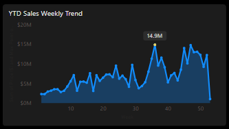
YTD Sales Weekly Trend:
- Display a line chart illustrating the weekly trend of YTD sales. The X-axis should represent weeks, and the Y-axis should show the total sales amount.
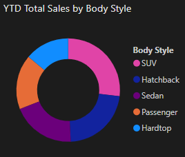
YTD Total Sales by Body Style:
- Visualize the distribution of YTD total sales across different car body styles using a Pie chart.
YTD Total Sales by Color:
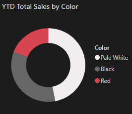
- Present the contribution of various car colors to the YTD total sales through a pie chart.
YTD Cars Sold by Dealer Region:
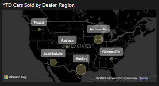
- Showcase the YTD sales data based on different dealer regions using a map chart to visualize the sales distribution geographically.
Company-Wise Sales Trend in Grid Form:
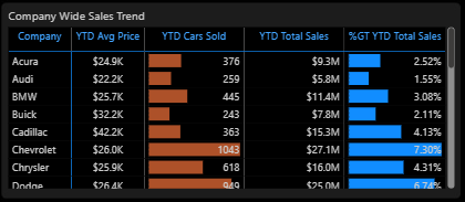
- Provide a tabular grid that displays the sales trend for each company. The grid should showcase the company name along with their YTD sales figures.
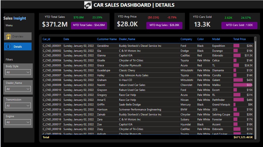
Details Grid Showing All Car Sales Information
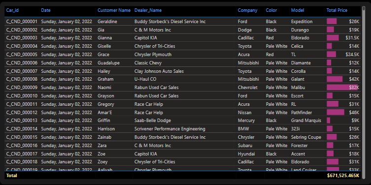
- Create a detailed grid that presents all relevant information for each car sale, including car model, body style, colour, sales amount, dealer region, date, etc
Steps followed
Data Quality Check/Data Cleaning
Applied Steps:
- Check Data Quality: Utilize the "Applied Steps" pane in Power Query Editor to review any existing transformations made to the dataset, such as removing null values, filtering rows, and replacing values.
- Replace Values: Uitlized power Query to replace values in column 'engine type' to standardize data.
View the Quality of the Data
- Column Quality: Use the "Column Quality" feature to ensure that the "Valid" metric is 100%, meaning there are no empty or null values.
- Column Distribution: Check the distribution of data in each column to identify any anomalies or outliers.
Create a Date Table
Creating Date Table:
- Use DAX to create a Calendar table for time intelligence operations:
- Calendar Table = CALENDAR(MIN('car_data'[Date]), MAX('car_data'[Date]))
- Additional columns such as "Month Name" and "Week of Year" should also be created using appropriate DAX functions.
- Year = YEAR('Calendar Table'[Date])
- Month = FORMAT('Calendar Table'[Date],"MMMM")
- Week = WEEKNUM('Calendar Table'[Date])
Data Modeling
- Build Relationships: Establish relationships in the data model by connecting the Date Table to the main car sales table using a one-to-many relationship on the date fields.
Creating KPIs and Measures
- YTD Total Sales: YTD Total Sales = TOTALYTD(SUM(car_data[Price ($)]),'Calendar Table'[Date])
- MTD Total Sales: MTD Total Sales = TOTALMTD(SUM(car_data[Price ($)]),'Calendar Table'[Date])
- YoY Growth in Total Sales: YoY Sales Growth = [Sales Difference] / [PYTD Total Sales]
- Sales Difference: Sales Difference = [YTD Total Sales] - [PYTD Total Sales]
- Dynamic Sales Growth Indicator: Sales Difference Colour = IF([Sales Difference] > 0, "Green", "Bad")
- Concatenate MTD Sales: MTD KPI = CONCATENATE("MTD Total Sales: ", FORMAT('car_data'[MTD Total Sales]/1000000, "$0.00M"))
- YTD Average Price:
YTD Avg Price = TOTALYTD([Avg Price], 'Calendar Table'[Date]) - MTD Average Price:
MTD Avg Price = TOTALMTD([Avg Price], 'Calendar Table'[Date]) - YOY Growth in Average Price:
YoY Average Price Growth = [Avg Price Diff] / [PYTD Avg Price] - Difference between YTD Average Price and PTYD Average Price:
Avg Price Diff = [YTD Avg Price] - [PYTD Avg Price] - Concatenate MTD Avg Price:
MTD Avg KPI = CONCATENATE("MTD Avg Sales: ", FORMAT([MTD Avg Price]/1000, "$0.00K")) - YTD Cars Sold:
YTD Cars Sold = TOTALYTD(COUNT(car_data[Car_id]), 'Calendar Table'[Date]) - MTD Cars Sold:
MTD Cars Sold = TOTALMTD(COUNT(car_data[Car_id]), 'Calendar Table'[Date]) - YOY Growth in Cars Sold:
YoY Cars Sold Growth = [Cars Sold Diff] / [PYTD Cars Sold] - Difference between YTD Cars Sold and PTYD Cars Sold:
Cars Sold Diff = [YTD Cars Sold] - [PYTD Cars Sold] - Concatenate MTD Cars Sold:
MTD Cars Sold KPI = CONCATENATE("MTD Cars Sold: ", FORMAT([MTD Cars Sold]/1000, "0.00K")) - YTD Sales Weekly Trend: Create a line chart with weeks on the X-axis and total YTD sales on the Y-axis.
- Use DAX to highlight the max point: `Max Point on Chart = IF(MAXX(ALLSELECTED('Calendar Table'[Week]), [Total Sales]) = [Total Sales], MAXX(ALLSELECTED('Calendar Table'[Week]), [Total Sales]), BLANK())`
- YTD Total Sales by Body Style: Use a Pie chart to visualize sales distribution across different car body styles.
- YTD Total Sales by Color: Use a Pie chart to visualize sales distribution across different car colors.
- YTD Cars Sold by Dealer Region: Utilize a map chart to showcase YTD sales geographically by dealer region.
- Company-Wise Sales Trend: Present a grid showing the YTD sales for each company.
- Detailed Grid of Car Sales: Create a grid displaying detailed information for each car sale, including model, body style, color, sales amount, dealer region, date, etc.
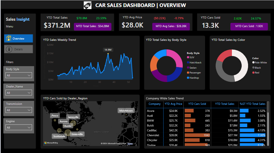
- Total YTD Sales: $371.2 million
- Increase from Previous Year: $70.8 million (+23.59%)
- YTD Average Price: $28,000
- Change from Last Year: Decrease of $200 (–0.79%)
- YTD Cars Sold: 13,300 units
- Increase from Last Year: 2,600 units (+24.7%)
- Highest Sales Week (36th Week of 2023):
- Total Sales: $14.9 million
- Consistently High Sales:
- From Week 45 to Week 52 in the last quarter of the year.
- Austin: Cars Sold: 2,296 units
- Janesville: Cars Sold: 2,113 units
- Scottsdale: Cars Sold: 1,912 units
- SUV: 29% of YTD sales
- Hatchback: 22% of YTD sales
- Sedan: 20% of YTD sales
- Pale White: 47% of YTD sales
- Black: Significant contributor
- Red: Significant contributor


Year to Date Sales

Year to Date Average Price

Year to Date Cars Sold

Visualizations and Charts
Snapshot of Dashboard (Power BI Desktop)
Overview:

Details:
